
In working with beginner nature journalers who want to add watercolor to their pages, I have noticed that whenever someone is struggling, if I talk with them about their supplies, they are almost invariably using inexpensive student-grade paints (either in pans or from tubes) and cheap brushes.
I’m a big fan of using good quality paints , brushes, and paper from the outset. The top reasons are:
Inexpensive or “student grade” paints are often boosted with filler (chalk) and they can sometimes be difficult to blend, nor do they flow or cover as well. Pure-pigment professional paints such as Daniel Smith’s Extra Fine Watercolors (there are many great brands: M. Graham, Winsor Newton, Schmincke) flow beautifully and have rich colors that blend well. Winsor Newton, Daniel Smith, and Holbein also make professional quality dry cake paints, available in half-pans (NOTE: Be aware that Winsor Newton "Cotman" products are student-grade. Look for the word "Professional" in the product description.)
I prefer tube paint that I dispense into half or full pans. It’s much more economical than buying pre-filled pans, but most of the top makers produce excellent pre-filled pans (see above). [A word of caution: sadly, avoid handmade paint makers on Etsy and similar unless you get a direct recommendation; I have bought from half a dozen, and all were poorly mixed or had a lot of chalk filler. Exception: Greenleaf & Blueberry paints are amazing, absolutely gorgeous. Email me if you know of other hand-makers who produce high quality.]
A good brush holds plenty of water, releases it with more control, and will have a nice, sharp tip.
You actually can paint anything in a nature journal with just one brush, a “round” style with a nice, sharp point. It can help to have one flat brush for a few things but it’s not necessary. I have a small flat travel brush but haven’t used it in over a year . . .
Look for a brush with natural bristles (squirrel is less expensive usually than sable) or a good combo such as those by Silver Brush Black Velvet; the #8 is only $20 and is a fantastic brush). You can cut the handle down for small field kits, if you like. My favorite is the Isabey squirrel mop travel brush (between $30 and $40).
In addition to a sharp tip, look for a good-sized “belly” for holding water.
Good brushes won’t shed hair onto your paper.
Good paper makes all the difference as it holds up to washes and is archival so it won’t yellow. Cheap paper will bleed through, saturate too quickly, and tear when wet. If it is really poorly made, it might have lignin, which will yellow and become brittle with age. Good paper isn’t necessarily expensive, either. For my journal, I buy 100% cotton (lignin- and acid-free), 90-pound, 9x6 watercolor paper from Bee Papers ($12 per 50 sheets). It also comes in 130-pound weight, which I find too thick for my journal, but would hold up to extensive water washes. However, I have not found the 90-pound to be an issue with washes. I add holes with a hole-punch.

Beginners are also tempted to start with a bunch of colors. But I argue that keeping it simple is better and that learning to paint with a “triad” forces the beginner to learn about color relationships and value more quickly. With just five colors you can create any color you need, including blacks and grays.
A triad = cyan (blue), magenta (“red,” though red is not a primary because it is made from magenta+yellow); and yellow.
My current mini “stand up” color palette comprises:
Old Holland Manganese Blue Genuine (a true cyan blue; I used to use Cobalt Blue, and it works just great as a cyan)
Daniel Smith Quinacridone Rose Permanent (a true magenta, or “red”; it’s a gorgeous rich rose and can become a very stunning red with the tiniest bit of yellow; I used to use Alizarin Crimson, but you can’t get a magenta-y rose out of a red, but you CAN get a red out of a magenta!)
Daniel Smith Aureolin Yellow (okay, I won’t go into full detail here, because this is aimed at beginners, but there are paints that are called “fugitive” because they can fade over time if exposed to light . . . and Aureolin is one of them; I still have a tube to go through, and I love it, and since my journals are not exposed to light I’m okay with that, but I’ll be looking to switch to a yellow such as Nickel Azo).
Daniel Smith Burnt Sienna
Daniel Smith Indanthrone Blue (I used to go without a dark blue, but for fast, rich blacks and fascinating grays, nothing beats Indanthrone Blue + Burnt Sienna).
Clearwell Caves Purple Ochre (I’m having a love affair with this offbeat, rich, highly granular earth pigment from a 6,000-year-old ochre mine in England; it makes the most amazing rocks and earths, especially perfect for me now, working as Art and Science Coordinator at the Desert Laboratory on Tumamoc Hill, which is volcanic).
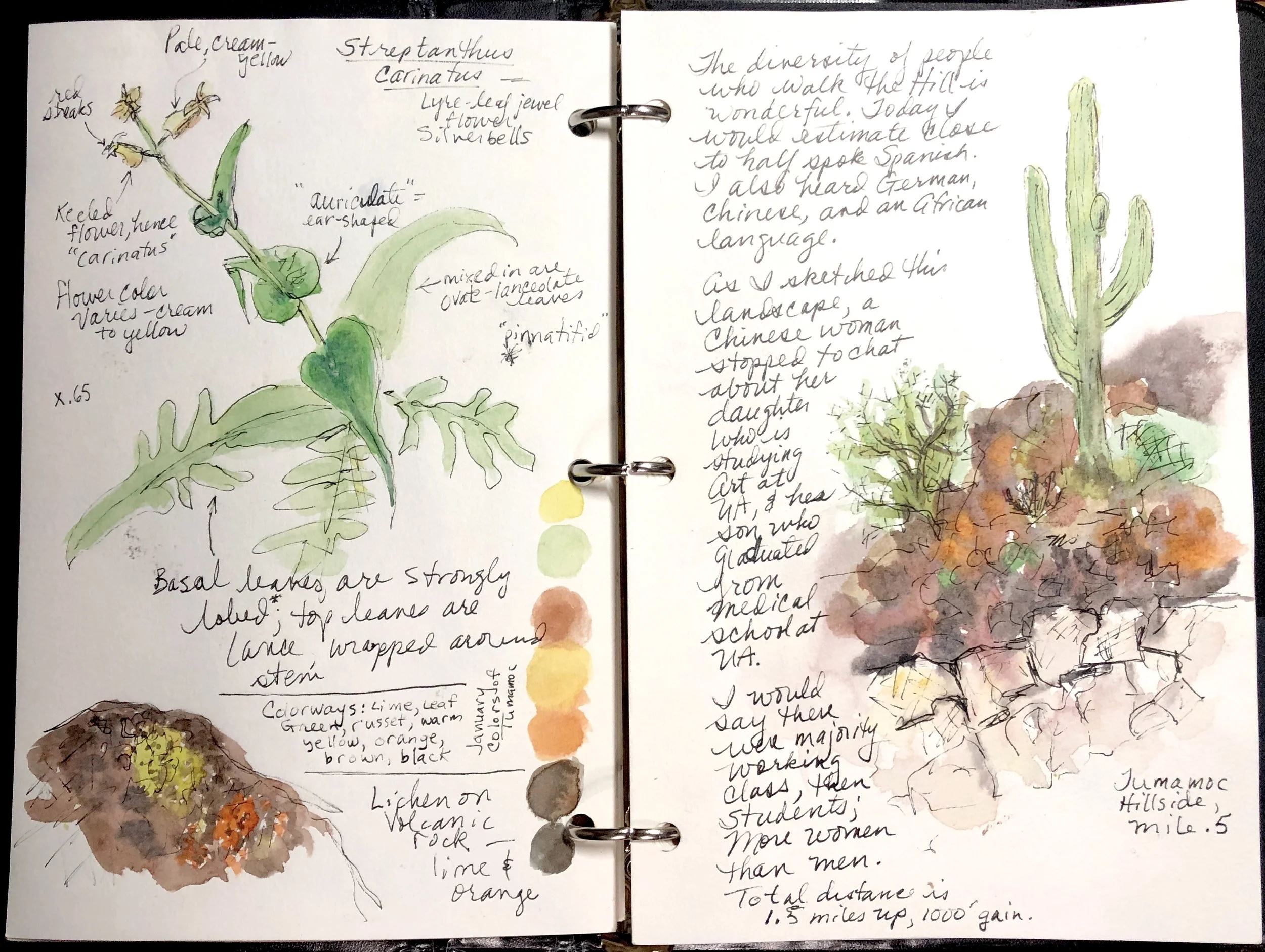
This was sketched with the paint from the palette listed above, while hiking up Tumamoc Hill; the rocks were painted with my burnt Sienna, indanthrone blue, and my wild-card favorite purple ochre from Clearwell Caves in England. Eventually, as you become proficient with triad painting (cyan-magenta-yellow) you can add a few fun extras that suit your habitat.
Another benefit of mixing colors: you can create a puddle of variable green for example, which is sort of “marbled” (ie: not fully mixed) and when you use that to paint leaves it creates more natural variation and looks less “flat.” Painting something monotone is a beginner’s mistake, since rarely is something one pure color in nature.
I suggest starting with transparent colors because they blend beautifully into bright, clear colors and you don’t have to fuss with accidentally creating “mud” by blending too many opaque colors. I also tend to default (for rapid field sketching) to easily lifted colors, avoiding staining colors such as the pthalos.
Tip: watercolors come in different transparency levels, they come in different “sticking” levels, and are also rated for “granulation.”
Transparent watercolors do not blot out or cover other colors or lines already on the paper, and you can paint them over each other to create new colors (called “glazing”; you can paint a transparent blue over a yellow and it shows green, for example).
Non-staining watercolors can be “lifted” off the paper especially when wet and to some degree when dry and you re-wet them. If I blork out of an area into a spot I didn’t want paint, I can quickly swipe it off with a tissue or finger. (Staining paint like Pthalo Blue once it hits the paper is there forever and ever.)
Granulating paints are cool, they have a “texture” that is interesting. Ultramarine blue is one such color that is quite popular. I have tended away from it recently because I’m liking my current setup too much, but loads of people love it. Using granulating colors takes practice and so is not recommended for beginners. Also, different paint brands have different levels of granularity, and it takes some experimentation to find the level that suits you.
I hope these tips are helpful. A parting thought, as always, is:
KEEP IT SIMPLE in your kit, and focus on drawing and painting every single day. No amount of fancy brushes and expensive paint and colors will make you a better sketch artist. Only practice will do that!
Please email me via the Contact menu item above if you would like to join free nature journaling meet-ups in southern Arizona.
[Special thanks to reader and fellow nature journaler and artist Tom W. for input on this post.]