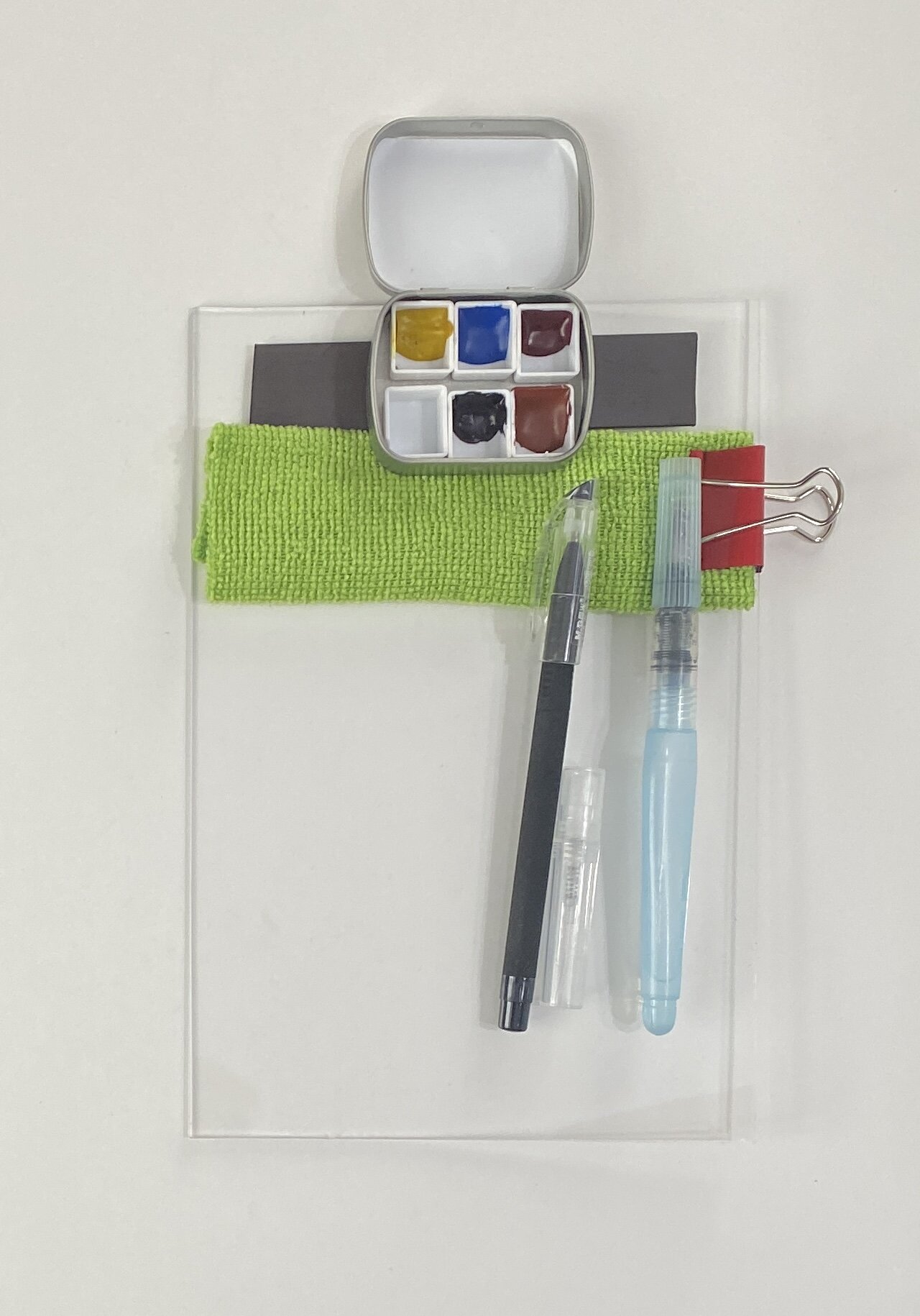
I sell the Minimalist Paint Set on its own and as part of a full kit with a palette-holder and more.
When I was trying to learn watercolor ten years ago, I became very frustrated because I dove deep into a huge palette of colors (24!) that I knew nothing about. I tried several online classes, but none covered the basics of paint and one confused me hugely by breezing through quick descriptions of setting up your palette as either “analogous,” “complementary,” or “split-complementary” as though I would know what these were. All just gave students a list of paints to buy, focusing on techniques rather than paint characteristics and behavior.
I ended up with a confusing palette comprising multiple yellows, lots of blues, myriad reds, pre-mixed greens, bunches of earth colors, and many exotics (turquoise! those electric pthalos!).
The frustration of making weird colors, lots of “mud,” and no progress took the joy out of journaling for me, and made me back off sketching and adding color for several years.
Thankfully I persevered and through a lot of research finally found Jane Blundell, an Australian artist and color wizard whose blog posts unveiled the mysteries of watercolor: the fact they come in transparent and opaque consistency, warm tones and cool tones, and can be lifting or staining. And best of all, she introduced the concept of triad painting and busted the myth that the three primary colors are red, blue, and yellow.
After a lot of experimentation I came away with a simple palette of just five colors, the core of which is a true primary triad comprising a cyan, a magenta, and a yellow. Red and blue are not primary colors, even though that’s still widely taught; primaries are the colors from which you build all other colors. You can make a red (yellow + magenta) but you can’t make a magenta, for example. You can’t make a true cyan, nor a yellow. Cyan is a very specific bright blue-green. If you have ever heard of full-color process printing referred to as “CMYK” printing, that’s cyan-magenta-yellow-black. All printed colors come from just those primaries plus black.
I ended up choosing Daniel Smith Manganese Blue Hue as my cyan, Quinacridone Rose as my magenta, and Aureolin Yellow (Cerulean works as a cyan but it’s not as bright). These are bright, nearly neutral (veering toward cool), and transparent colors that mix easily to form vibrant, beautiful secondary colors (green, orange, purple) and tertiary colors (red, turquoise, maroon and so forth, see the chart below). Mix your cyan, magenta, and yellow together and you get a gorgeous brown.

With a little more experimenting I decided to add a very dark, very “warm” blue called Indanthrone to the palette, along with burnt sienna. These bonus colors are the key to a very versatile little set of paints. Burnt sienna mixed with the dark blue creates an instant rich black and a full array of grays, from steely to warm and earthy. The warm blue added to yellow gives you perfect pine-green; adding it to the other colors will result in changing a “cool” color to a “warmed” color.
Burnt sienna on its own is perfect for landscapes or add a tiny bit of it to your yellow and it creates that tawny dormant-grass color that is so common in landscapes. Add a little to magenta and you get an adobe rose that is perfect for sandstone. See the second chart below for the full array of colors using the Minimalist set. Thanks to Bethan Burton in Australia (International Nature Journaling Week), I learned that you can “mute” your brighter colors by adding its opposite on the color wheel. The muted and warmed oranges and yellows are perfect quick-substitutes for some of the ochres.
I hope this article helps you if you are feeling overwhelmed by watercolor and so many choices, or you just feel you are carrying too much stuff. I’ve included a video link below to show the process of mixing if you have not done so before.