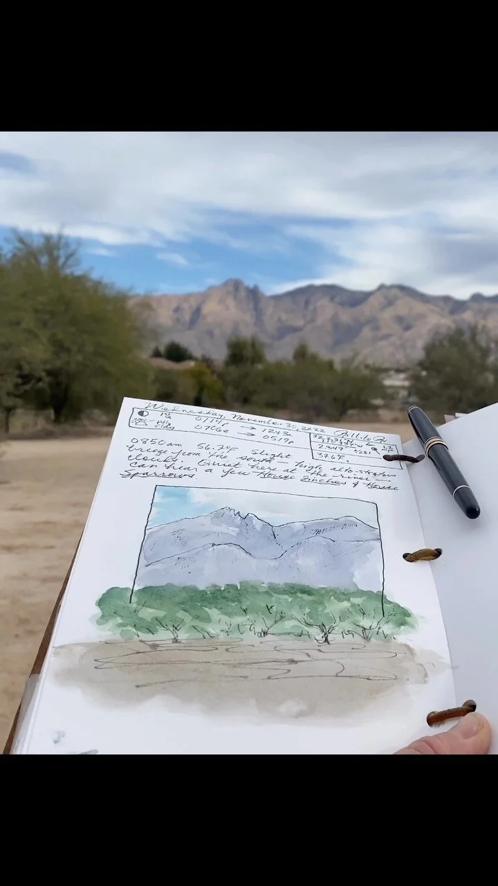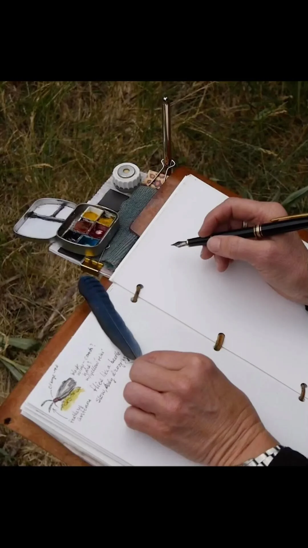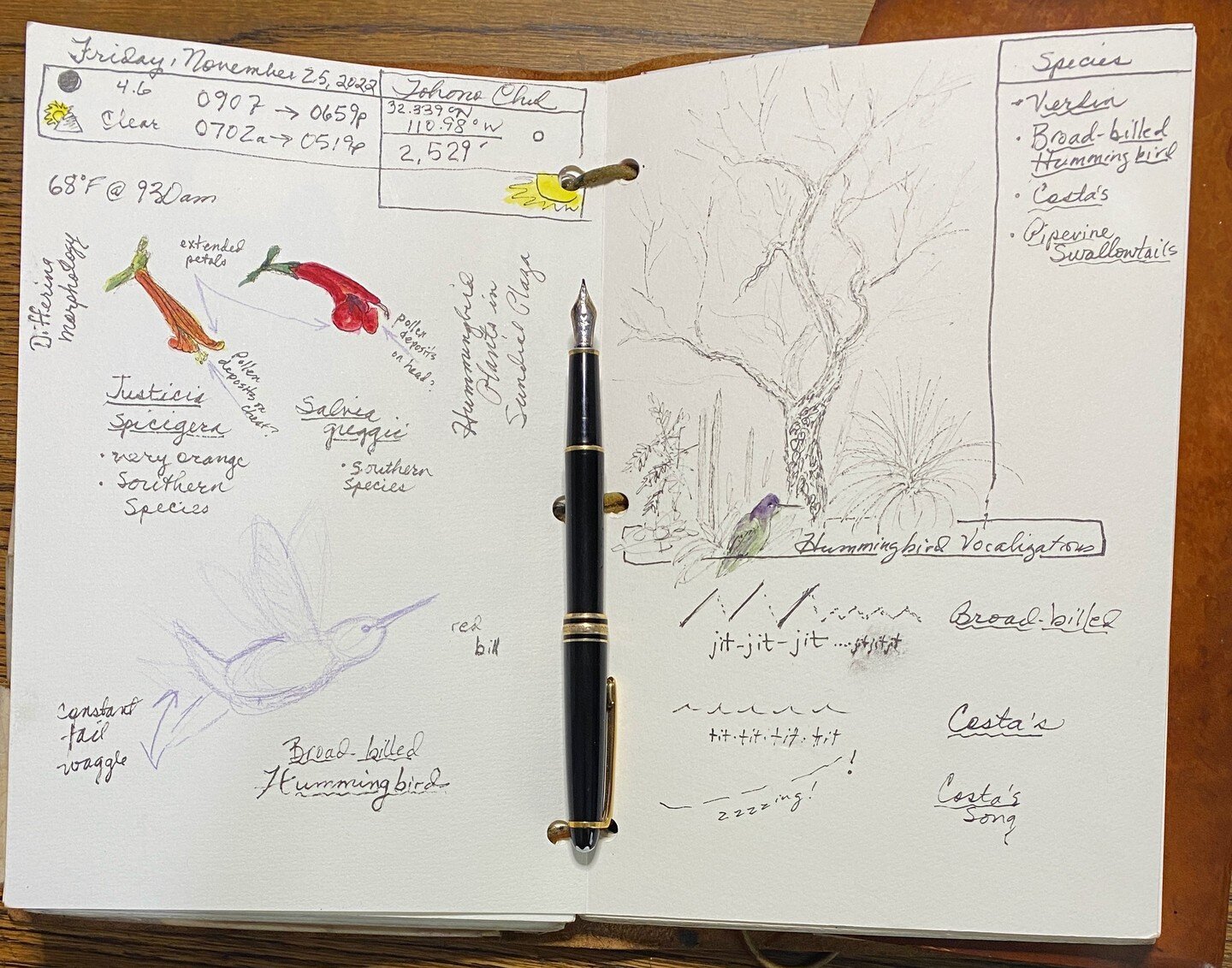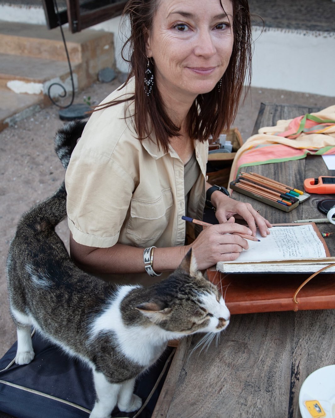
watercolor

Saguaro snowy scene 90-second tutorial

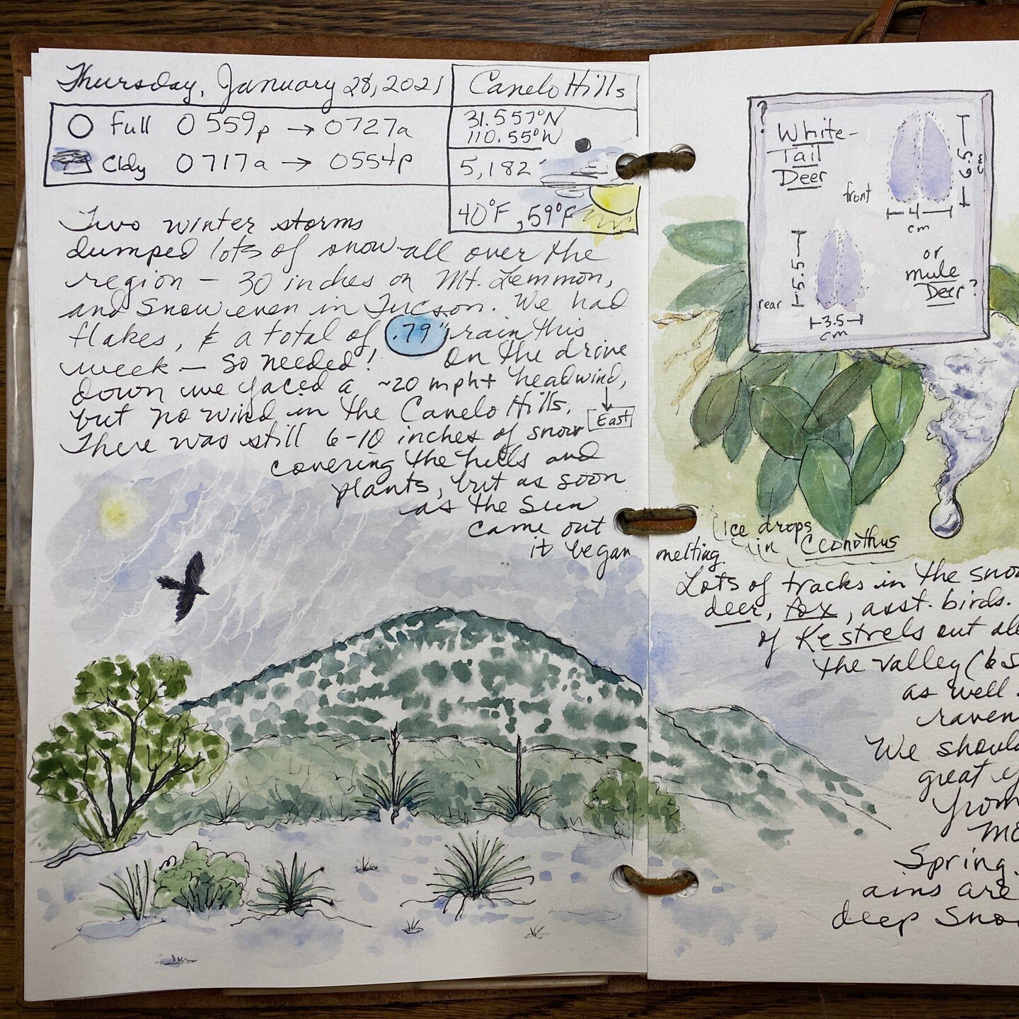
It's fun and easy to make quick "landscapitos" using just a few colors + white gouache. I laid a duo-tone sky / background using Manganese Blue Hue graded into Indanthrone Blue. Spatter with white gouache while damp. Let dry. Add your trees or cactus (I used Indanthrone mixed with Aureolin Yellow to make dark green), making the ones in the distance smaller and fainter. Add smaller shrubs if desired, with a dark color (Indanthrone), for contrast. Add snow with thick white gouache, then a few snow flurries on top, and voilá! A snowy landscapito! [Sound on for cheery holiday music!]

Skyscapito Meet-up No. 9 – Winter Skyscapitos

Inspired by and in collaboration with Journaling with Nature’s Bethan Burton, this is our own informal “Skyscapito Appreciation Society!” A “skyscapito” is a small skyscape we create in our nature journals, similar to the “little landscapes” John Muir Laws loves to create.

Join me (Roseann Hanson, of the Field Arts Institute), Bethan, and Deborah Conn as we host an hour (or a little more, if needed) of sharing our sky passions.

THIS IS NOT A WORKSHOP! It's a casual meetup of like-minded sky aficionados, nature journalers, and field sketchers.

This session let’s celebrate the coming holiday season by creating / sharing winter skyscapitos — you could include snow scenes, decorated pine trees, winter clouds, or even the Aurora!

FREE but registration is required, for security reasons. SIGN UP HERE

WHEN WE MEET: Saturday, December 10 at 1 pm Arizona USA time

LENGTH: About an hour

Please use a timezone converter app to make sure you have the right time!

http://www.exploringoverland.com/skyscapito


Three Field Arts offerings this fall

Virtual Field Trip: Explore the Alaskan Arctic with Roseann [FREE with registration]

Virtual Field Trip: Explore the Alaskan Arctic with Roseann [FREE with registration]

Fearless Watercolor for Field Sketching, a Desert Laboratory on Tumamoc Hill workshop with Roseann

Fearless Watercolor for Field Sketching, a Desert Laboratory on Tumamoc Hill workshop with Roseann

Introduction to Digital Nature Sketching on iPad with Procreate App, a Desert Laboratory on Tumamoc Hill workshop with artist Bill Singleton

Introduction to Digital Nature Sketching on iPad with Procreate App, a Desert Laboratory on Tumamoc Hill workshop with artist Bill Singleton

Are you ready for some great skills workshops and a virtual field trip?

  • Saturday, October 16 at 9 am Pacific: VIRTUAL FIEL TRIP: EXPLORE THE ALASKAN ARCTIC with Roseann. I just returned from two weeks exploring this amazing landscape; I’ll take you there virtually! See my field journal pages and narrative, here. For more details and to sign up (required, free), click here: https://arizona.zoom.us/meeting/register/tZIqdeCvqjkrGt2LJyrjXViL0Ztj-B1UlpQU

  • Saturday and Sunday, October 23 and 24, starting 9 am Pacific: FEARLESS WATERCOLOR FOR FIELD SKETCHING, a Desert Laboratory on Tumamoc Hill workshop with Roseann. This is an expanded version of a workshop I offered earlier this year, with the addition of more teaching time and a 2-hour live in-person session at the Desert Laboratory on Tumamoc Hill; if you aren’t in Tucson, you can dial in on Sunday remotely for consultation from your own field location! For more details and to sign up ($75 fee, with optional supplies to be mailed; you can also opt out of either day for a lower fee), click here: https://www.eventbrite.com/e/fearless-watercolor-for-field-sketching-tickets-181232299687

  • Saturday, November 20 at 9 am Pacific: INTRODUCTION TO DIGITAL NATURE SKETCHING ON IPAD WITH PROCREATE APP, a Desert Laboratory on Tumamoc Hill workshop with artist Bill Singleton. This is a rare opportunity for a live, online class with one of the masters of field sketching, either traditionally or on an iPad. For more details and to sign up ($55 fee, with optional supplies to download), click here: https://www.eventbrite.com/e/introduction-to-digital-nature-sketching-procreate-and-ipad-tickets-181333873497

Alaska Explorations – Reflections on "pencil miles"

We recently returned from the high and middle Arctic regions of Alaska—a research trip for Jonathan’s next fiction novel in his Clayton T. Porter series.

For two weeks solid I was able to explore new habitats, learn new species, and sketch and write extensively from early morning until late in the evening—a whopping 27 pages worth! And I can confidently say:

  1. Alaska is a superb natural treasure, as vast and wild and full of wildlife and rich cultural history as anywhere we’ve been in Africa . . . and . . .

  2. “Pencil miles” work, even in the short-term (thanks, Jack Laws).

I’ve posted below all the pages in chronological order.

It’s particularly interesting to note the changes from day one at the natural history museum at the University of Fairbanks, where I jumped into live sketching after several weeks hiatus from any journaling at all. I dove in (after writing the metadata, of course) with the 8-foot-tall stuffed grizzly . . . and it just went all wobbly wonky on me. Too many people around, too many people watching over my shoulder, I just couldn’t find my sketching ju-ju.

But I stuck it out. Then I took a deep breath and centered myself and concentrated on the walrus . . . and after zenning it out, I got it. My sketching started settling.

Over the course of the next 11 days watch how the quality progresses. I even tackled quite a few live-in-the-field animal sketches where I only saw the critter for a very short time. Into the second week, after struggling a little with pen-only live animal sketching, I adopted a purple-leaded pencil* to do these initial one- to two-minute gesture sketches, and left them as-is. Then later, using photos my husband shot as reference, I completed more detailed sketches in camp, using my gesture sketches as baselines. I really like the peregrine and muskox gestures.

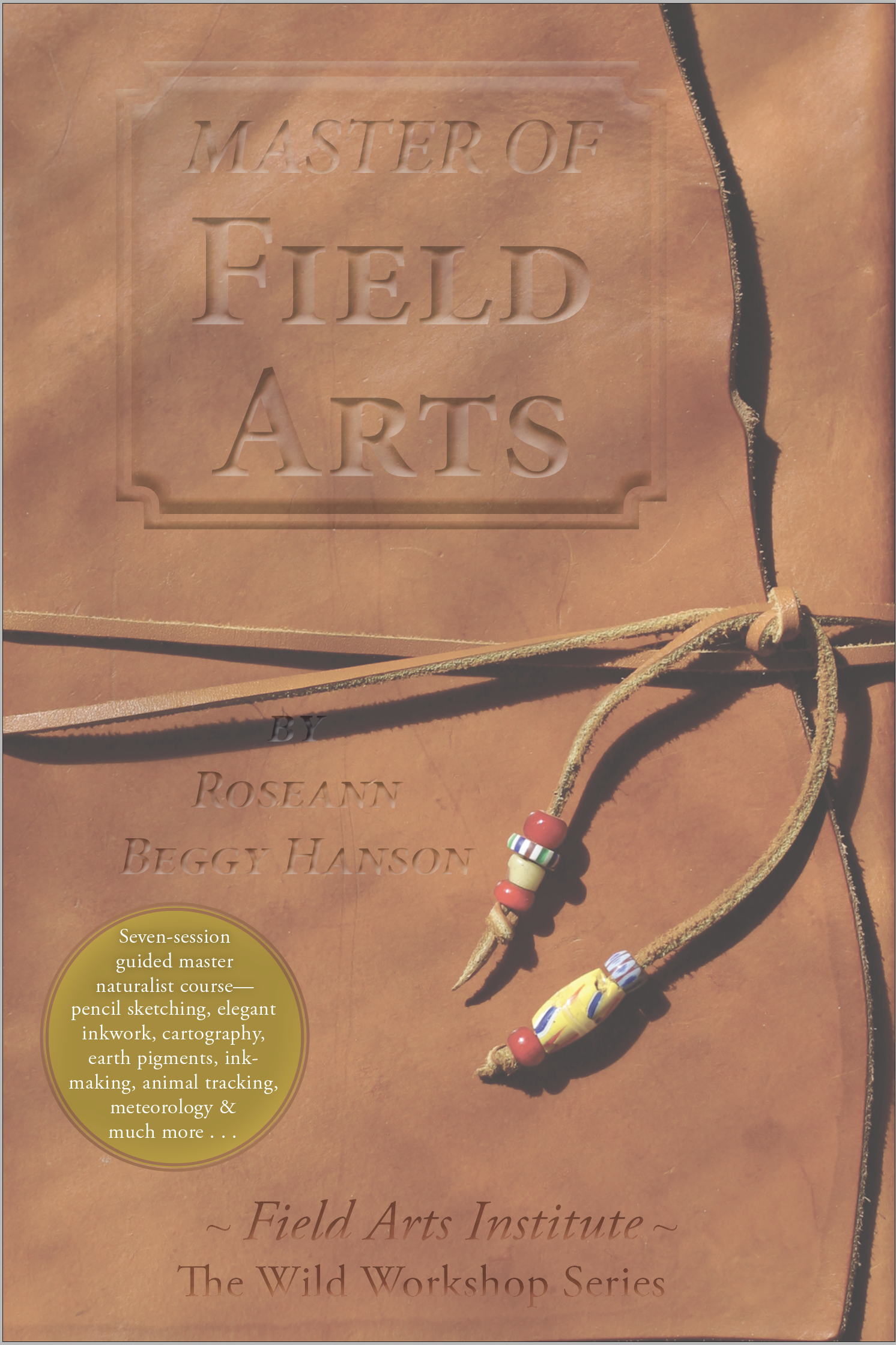
I returned completely energized and excited to complete my next book (80% done), Master of Field Arts. I also will be offering several workshops:

* I don’t like graphite pencil for journal sketches because the soft pigment can smudge terribly on my pages. Jack Laws likes a non-photo blue pencil, which I tried but found I didn’t really like, perhaps because the blue pigment is rather hard and unexpressive. Recently I saw Jack using a purple-colored pencil, so I ordered purple refills for my mechanical pencil—and I really like it. Soft and expressive, light enough to not overpower the gestures but with enough character to create really pleasing gesture sketches.

DSC01476.jpeg
IMG_6156.JPG
DSC01665.jpg

Feral Watercolor: Making paint from your own found pigments April 24, 2021

Poster-12.jpg

Let’s play in the dirt!

This two-and-half-hour live and interactive online workshop hosted by the Natural History Institute in Prescott, Arizona, will introduce you to the magical world of true place-based art by teaching you how to:

  • find rocks and soil from which to create paint;

  • how to process them into watercolor paint (also applicable to oil or other media)

Optional kit can be purchased and mailed to you in advance, containing:

  • sample pigment

  • binder agent

  • a list of household items you can use to process the paint without a lot of expensive tools

Length: 2.5 hours

When: April 24, 2021

Start Time: 9:30 am Arizona / PDT / (12:30 pm EDT / GMT - 7 )

(Having trouble figuring out time zones?Use this calculator: https://www.timeanddate.com/worldclock/converter.html)

Format: online via Zoom (you will receive a log-in link)

Cost: $58

To sign up: Please register with Natural History Institute at https://naturalhistoryinstitute.org/feral-watercolor-workshop-registration/

Order the optional pigment kit separately at left (from me directly)

Feral Watercolor Workshop 11-2020.jpg

New series: Lessons from the Field

IMG_4559.jpg

One of the joys of field sketching in our nature journals are those moments when things just “click” and you love your notes, your sketches, the harmony of the page . . . and then . . . there are the times it just feels like a struggle.

These pages from a recent trip to a wildlife area in southeastern Arizona—an agricultural “wetlands” (it’s artificial) called Whitewater Draw—were the latter.

It was a beautiful day, and like most of the people visiting, we were there to see the Sandhill Cranes, which overwinter in the surrounding valley in the tens of thousands. I was looking forward to some great practice live-sketching birds—and ones that are mostly stationary, my favorite kind!

It was crowded, which is always a challenge to me whilst sketching. But the main challenge was just that my initial sketching felt stiff and difficult, a real struggle.

After a few moments I noticed a possible reason: the first bird I had chosen to sketch was facing to the right.

Thinking on it, I realized that I often find it really hard to sketch animals in that aspect. Going back over some of my other journal pages after I got home, I found many examples of live-sketching where the subject was facing right, and yes, those sketches were definitely a struggle. Hmmmmm…is this a real “thing?”

I did some preliminary research, and there was plenty of chatter on art forums of others who noticed the same thing . . . mostly beginners. So it’s not just me.

Thinking some more on this, I realized my crane sketch was the hardest, but the duck was easier—it started out hard, but then I quickly got it.

Why?

I now know why:

  • I was rushed when starting the crane drawing.

  • People all around, feeling “pressure” to get going, not taking my time.

  • And most important: I was drawing a bird. I should have been drawing shapes. By trying only to draw a bird, I was failing.

Look at the duck sketch. Much better and I did the overall shape really quickly and confidently. It just worked. Because:

  • I was drawing shapes, not a bird.

Going back to some of the art forum chatter, there are all sorts of theories about why some of us find it hard to sketch subjects facing right . . . one of the best theories was that if you are right-handed you have to draw the most important lines towards your palm, into it, and your fingers are cramped inwards—instead of the simple wrist motion to the side when drawing a left-slanted line.

I think it’s a combination of that plus the too-intent focus on the subject rather than shapes. With the duck I proved if you are just drawing shapes, you can overcome that cramped tendency by loosening up and drawing the shapes in a wrist-motion rather than obsessing on a beak or an eye.

Lesson from the Field: take your time to think about the act of sketching and consciously look for shapes rather than obsessing on the subject itself. Those few extra moments—maybe even just one minute—to find the shapes and talk yourself through them as you sketch will make it so much easier to be successful.

Using the clear Perspex Palette-Easel to Make a 3D-Cube Landscape

IMG_4319.JPG
IMG_4307.JPG

I really love John Muir Laws’ “3-D” landscape cubes — in which you envision taking a giant cutter and pulling a cube out of a landscape, showing the sliced edges and details such as soil and creeks and roots (see here and here for examples). Laws details them in his wonderful book The Laws Guide to Nature Drawing and Journaling.

But I struggled with doing these complex drawings “live” in the field. Where to place the cube, how to envision placing the elements correctly. I always drew mine from photos, then actually printed them and sketched the cube over the photo, or used Photoshop to put a cube over the digital photo.

Earlier this month I introduced the new clear Perspex Palette-Easel (with magnet strip) and now I have the perfect tool to make all the cubes I want! Here’s a recent one I drew in the field, in southern Arizona’s Dragoon Mountains, showing the step-by-step. The whole thing, including watercolor, took about 40 minutes.

Start by drawing a cube shape in your notebook:

IMG_4309.JPG

Then, draw or trace the same shape on your palette with the dry-erase marker. It’s important that they are the same proportions, so that’s why I just traced mine:

IMG_4307.JPG

Now, hold the palette at arms-length in front of you, closing one eye, and trying it on different views.

I wanted to include some boulders “spilling” off one side, and show the grassland and trees and roots as part of the “slice,” so I settled on this view of part of the hillside.

Hint: hold the palette with your thumb on the lower corner; mark a tree or rock that is right at or behind the thumb and use that marker to anchor the palette each time you hold it up. You need to be able to get the same view each time you lift up the palette to study the scene as you draw the landscape on your paper, in pencil:

IMG_4311.JPG

It may take several tries to get everything placed where you want it. I started with the “back” of the cube, sketching the far hillside and then then nearer rocky slope with the spires, then moved to the “front” where I sketched the slope (had to do it twice to get it right), with the edge of the grassland where I wanted the “slice” into the earth. Then the boulders spilling off the right, and then finally the details on the left, completing the landscape by bridging the front and back of the scenes.

Hint: don’t get too detailed, this is a “landscapito” sketch, so keep it loose and fun.

Next: carefully ink the drawing. Remember NOT to ink in the cube lines in the center, just along the bottom and sides, stopping where any landscape detail ends and the sky begins.

IMG_4315.jpg

Note that I inked the lower right “corner” of the grassland slice, and added the moon above.

Once the ink is dry, erase the pencil lines with a kneaded eraser (which won’t leave eraser-bits all over the paper).

And now the fun part, add watercolor!

IMG_4318.JPG

Don’t forget to make the details that are farther away (like the hill in the background) less distinct (I used a warm blue and darker blue-greens to push it back).

IMG_4308 copy.JPG
IMG_4307.JPG

If you want to try this unique and fun way to represent a landscape, you can order your own Clear Perspex Palette-Easel with Magnet strip here.

Enjoy!

You can also try the 3D cube view on nearby subjects. This is a slice into a large boulder at Tohono Chul Park in Tucson. I used the perspex palette-easel to isolate the view, and then made sure to include the ground underneath and a little rodent b…

You can also try the 3D cube view on nearby subjects. This is a slice into a large boulder at Tohono Chul Park in Tucson. I used the perspex palette-easel to isolate the view, and then made sure to include the ground underneath and a little rodent burrow and plant roots.

Simplify! Learn to paint with three primary colors – January 9, 2021

Adding watercolor to your field notebooks and nature journals need not be an elaborate exercise in juggling dozens of colors and six different brushes!

I will introduce you to the simple technique of mixing any color you need from a triad — three primary colors (a cyan, a magenta, and a yellow) plus my own preferred “bonus” colors of burnt sienna and a dark blue.

It’s not hard, and it’s fast, simple, and fun!

Use your own paints (I’ll send you recommendations) or order my Minimalist Paint Kit or one of my paint tins with sample paints and paint along.

Length: 2 hours

Start time: 2:00 pm Arizona time (Phoenix) / GMT - 7 

(Having trouble figuring out time zones?Use this calculator: https://www.timeanddate.com/worldclock/converter.html)

Format: online via Zoom (you will receive a log-in link)

Cost: NOTE: free shipping has ended as of 1-4-2021; in order to receive paint kits, please also add Priority Mail shipping when you order.

  • $45 without any paint kits

  • $65 with mini paint tin and 5 paint samples

  • $82 with small paint tin and 5 paint samples

  • $90 with Minimalist Paint Kit with mini paint tin and 5 paint samples, water brush, micro-fibre rag, pen, Clear Perspex Palette-Easel with Magnet Strip and dry-erase marker

Access: You will receive log-in instructions after purchasing the class.

SIGN UP HERE: https://www.exploringoverland.com/shop/feral-watercolor-workshop-3356h

Wildcrafting Mayan Blue, a macabre pigment

IMG_3409.jpg

Many readers will remember my Feral Watercolor Project. Well, the rabbit hole just got huge. A warren, in fact: I recently subscribed to a pigment-of-the-month club from The Wild Pigment Project in Oregon.

My first wildcrafted color arrived this week—and I'm so thrilled, one of my favorite historical colors, Mayan Blue!

The pigment is made from the indigo plant (Persicaria tinctoria) by a process of fermentation and then adding a flocculant (dispersant), then drying to a powder. Then it's mixed with a clay.

This is exactly how the Mayans made their amazing blue . . . which is featured in surviving murals and which has been found many meters thick in the bottom of deep freshwater sinks called "cenotes." The reason is that the Mayans painted victims of sacrifice with the blue pigment before tossing the hapless people into the cenotes . . . gruesome but true.

I spent a morning processing this macabre blue into watercolor paint with ox gall and gum arabic. There's a fair amount of clay so it does not disperse super freely across the paper, but the color is rich, and bonus: it mixes beautifully with yellow ochre for deep forest green.

Here is a video of the mulling process:

Readers ask, what do you add to the pigment to make watercolor?

The short answer is you need a binder (to stick the pigment together) which traditionally is gum arabic (from an acacia tree in the African Sahel), a dispersal agent, to help the pigment flow with water, which is traditionally ox gall (yes, gallbladder stuff); and a humectant, usually honey, to keep it pliable. You can mix your own or you can buy Schminke's readymade watercolor mixer, and you're done!

Registration opens for nature journaling workshop with the Natural History Institute - July 31-Aug 2, 2020

J-and-R-Hanson-Marble-Cyn-5-17-1040087.jpg

Join me and the Natural History Institute for a multi-day workshop exploring nature through field journals—all live online, including unique virtual field trips and your own field experiences.

Friday, July 31 – 5:30 pm to 7 pm

Saturday, August 1 – 9 am to 2:30 pm

Sunday, August 2 – 1 pm to 3 pm

Saturday, August 8 – 10am to 11 am check-in

$110 USD

Keeping a nature journal or field journal can both deepen your connections to the natural world and help you learn more about it. Neither science education nor art training is needed—you will develop the skills of a naturalist and a field sketch-artist along the way.

This 4-session class will introduce the tools and processes of keeping a nature journal, with instructor Roseann Hanson. There will be an optional 1-hour check-in the following Saturday as well. Sessions will be recorded, for review and if you miss a day.

“Your observations, questions, and reflections will enrich your experiences and develop gratitude, reverence, and the skills of a naturalist . . . If you train your mind to see deeply and with intentional curiosity . . . the world will open before you.” - John Muir Laws, artist, naturalist, and author

In this class we will learn how to practice “intentional curiosity” as the core of nature journaling: to ask questions, to dig deeper, to focus our minds both intently and intentionally.

The class will include:

  • The nuts-and-bolts of journal-keeping (paper and ink types, archival systems, how to make entries that you can refer to later, laying out pages, prompts to jump-start observations, and tips on researching science questions sparked by your observations).

  • Easy tips that enable anyone to get started sketching and painting. Roseann will help free you from your inner critic and start sketching and painting. Art in a nature journal is not only lovely to see, but an important component of your skillset because the very act of drawing and painting something from life involves incredibly intense observation. Your brain is wholly occupied by only that thing you are observing and drawing—it is a kind of meditation that results in new insights, deeper understanding, and even reverence and gratitude.

  • Optional supplies package and book add-ons, mailed to you in advance, see below.

Instructor Roseann Hanson, who has been keeping a nature journal for more than 30 years, will be your guide on the journey to becoming a naturalist, nature journalist, and artist.

Optional supplies: Students may purchase my book, Nature Journaling for a Wild Life , which includes blank journaling pages, and Minimalist Paint Kit and other supplies prior to the class.

TO REGISTER:

Call or email the Natural History Institute 

(928) 863-3232, info@naturalhistoryinstitute.org

How to render 3D block maps

IMG_2652.JPG

Cartography is one of the oldest field arts—many ancient petroglyphs might actually be maps (there are several at Twyfelfontein in Namibia).

Here is a step-by-step pictorial on how to render a cool 3D map. I did this one from a photo after a visit to Cave Creek in southeastern Arizona's Chiricahua Mountains. The biggest challenge is pulling the "box" out of the 2D image and envisioning the "cut away" part in a way that works in a 3D cube. Thanks to John Muir Laws for the tutorial in his excellent Laws Guide to Nature Drawing and Journaling.

Study your photo or live landscape and decide where you want to pull out your 3D box. I wanted to be sure to depict the creek, especially the whimsical spillage off the box (idea stolen from Jack Laws). Getting the landscape right in the box is the …

Study your photo or live landscape and decide where you want to pull out your 3D box. I wanted to be sure to depict the creek, especially the whimsical spillage off the box (idea stolen from Jack Laws). Getting the landscape right in the box is the hardest part, and you will probably have to do 4 or 5 tries before it feels right. That's how many it took me on this one! I used this photo for inspiration; from the Friends of Cave Creek Canyon (FOCCC) on Facebook, by Steve Wolfe.

After studying your photo (or live landscape) and deciding where to pull out your 3D box, use pencil to draw a rectangle on your page. with all the corners and "bottom" included.

After studying your photo (or live landscape) and deciding where to pull out your 3D box, use pencil to draw a rectangle on your page. with all the corners and "bottom" included.

Using pencil still, sketch in the upper corners and limits of the landscape within the box. You can see I drew the right-most upper corner too high and fixed it later. Then I added the general creek location and the background.

Using pencil still, sketch in the upper corners and limits of the landscape within the box. You can see I drew the right-most upper corner too high and fixed it later. Then I added the general creek location and the background.

When I was happy with the placement of the landscape elements, I drew over the main parts in pen.

When I was happy with the placement of the landscape elements, I drew over the main parts in pen.

After the pen dries, erase the pencil lines that marked the structure of the box. Then go back with pencil and add details; I roughed in the rock spires, the slopes, where I wanted to make the darker patches of vegetation, and a few symbols for habi…

After the pen dries, erase the pencil lines that marked the structure of the box. Then go back with pencil and add details; I roughed in the rock spires, the slopes, where I wanted to make the darker patches of vegetation, and a few symbols for habitat types. When happy, I finalized in loose pen sketching, keeping the marks fairly light.

The final step was adding the watercolor, making sure to make the farthest mountains darker and warmer blue in tone so they feel like they are receding (instead of making them green or cooler blue). Don't go crazy on the details for something this size and this simple.

I decided to add the clouds and hawk as a fun whimsy.

New class registration open—Nature Journaling Feb. 21-23, 2020

L1000155.jpeg

If you train your mind to see deeply and with intentional curiosity . . . the world will open before you.” — John Muir Laws 

Keeping a nature journal can deepen your connections to the natural world and help you learn more about it. And the great thing is that neither science education nor art training is needed — you will develop the skills of a naturalist and a field sketch-artist along the way. 

In this class February 21–23, 2020, at Tohono Chul Park in northwest Tucson, students will learn to practice “intentional curiosity” as the core of nature journaling: to ask questions, to dig deeper, to focus our minds both intently and intentionally. Hanson will cover the nuts-and-bolts of journal-keeping from paper and ink types and laying out pages to prompts to jump-start observations and advice on researching science questions.

There will be easy tips to enable anyone to get started sketching and painting as you are freed from your inner critic. On one of the days I will be joined by a guest artist who will lead a 2-hour sketching-skills session.

By the end of the weekend you will leave with a new way of seeing the natural world, armed with new skills for recording all that you will experience. Simple supply list will be provided, but all you really need is a notebook, pen and your curiosity! Please bring a brown bag lunch Saturday and Sunday. The workshop meets from 5-7pm on Friday, February 21 and then from 9am-3pm on both Saturday and Sunday, February 22 and 23.

Price is $135 for Tohono Chul members or $150 for the general public and include paints and brushes to borrow. Hope to see you there!

https://tohonochul.org/event/nature-journaling-the-art-of-seeing-and-recording-the-world-around-you/

Observation skills: Heaven as a color

"Study of a peacock's breast feather" by John Ruskin (1873)

"Study of a peacock's breast feather" by John Ruskin (1873)

I have to draw a peacock's breast-feather, and paint as much of it [as] I can, without having heaven to dip my brush in.

This "Study of a peacock's breast feather" (1873) is an exercise in understanding by close observation and drawing. In the process, Ruskin saw that the tips of each filament were composed of "glowing" tones and "rainbow iridescence."

John Ruskin was a British polymath, and well worth getting to know. As a writer, he commanded international respect. He was an art critic and an art patron, a skilled draughtsman and talented watercolourist, and a fierce critic of prevailing social and political norms.

He wrote about nature and architecture, craftsmanship, geology, botany, Greek myth, education—a dizzying variety of subjects. Driven by his deep faith in social justice, he established the Guild of St George in the 1870s to right some of the social wrongs of the day and make England a happier and more beautiful place in which to live and work. He gave the Guild a substantial art collection for the benefit and education of the working people of Sheffield, where it thrives to this day (Guild of St. George).

Of note, he championed four great themes throughout his life, all of which are worth re-visiting for us all today:

  • No wealth but life. Ruskin abhorred the bad business practices that made the rich richer yet condemned ordinary people to drudgery and poverty.

  • The rural economy. Ruskin argued that work should be creative, fulfilling and rewarding.

  • Not for present use alone. Ruskin was inspired by old buildings and believed we should make beautiful things that will last.

  • Go to nature. For Ruskin, the natural world was the primary source of beauty, inspiration, and education, and the foundation for artistic practice.

I highly recommend a pleasant afternoon curled up by the fire reading both Ruskin’s works and the Guild of St. George website, for a lighter taste of this great thinker’s works.

Finding wild where you are

Leitner quote.png

I recently returned from a six-week exploration by Land Cruiser across Botswana and Namibia. I was afforded the luxury of writing, sketching, and painting every day in my nature journal with live—as in just feet from me, in most cases—elephants, zebras, giraffes, leopards, hundreds of birds, as well as discovering dozens of new-to-me plant species. I was in naturalist and sketch-artist heaven.

At home now, my surroundings suddenly became . . . well, mundane. I won’t lie. A bunny in the backyard just wasn’t the same as 65 elephants drinking, bathing, and play-fighting deep in the African bush.

It has been hard to keep up the daily sketching, and I struggled with withdrawal from intense nature experiences.

But the day after the bunny-you-are-not-an-elephant episode, I went for my usual 5K run and re-learned the joy of finding mysterious things in the familiar:

  • Two coyotes slipped across the road just 20 feet from me and circled a privet hedge . . . out of which shot at least three rabbits . . .

  • The coyotes then trotted down to Campbell Avenue, one of the busiest in Tucson even at 6 am, and I watched in horror and fascination as they stopped, watched traffic (literally surveying all the cars as they went by), then when a break came trotted to the median, where they waited, watching the correct and opposite direction, then proceeded across at the next break. Do they learn this from parents / grandparents / great-grandparents?

  • Turning back to my run, a Cooper’s hawk swooped across my path, with a mockingbird literally on its tail and back, bombarding, pecking, and scolding . . . Why does the hawk not swoop up and grab its attacker from the sky, instead of “scree-ing” in annoyance and fleeing?

  • And finally, as I rounded the third kilometer, I stopped to watch another Cooper’s hawk bathing in a rain puddle at the side of a quiet residential street.

Proof that one does not need to cross the globe to Africa—you can find the Wild where you are.

And so I give you, Yard Bunny, restored and appreciated:

IMG_1011.jpg

Postscript: My husband Jonathan Hanson has long been writing about what he calls “Fractal Exploration”—you take smaller bites of the world, and examine them more closely. Here is an essay he wrote within the last few years about slow and deep travel: Fractal exploration …

The art of seeing instead of looking: reasons to keep a nature journal

A nature journal is about observing–questioning–reflecting. My pages often contain circled question marks, to remind me to research into a question sparked by close observation. They also contain ink sketches and watercolor paintings, not just becau…

A nature journal is about observing–questioning–reflecting. My pages often contain circled question marks, to remind me to research into a question sparked by close observation. They also contain ink sketches and watercolor paintings, not just because they are attractive to me and a great source of relaxation, but because the very act of drawing and painting something from life involves incredibly intense observation. The whole world of stress and deadlines and discord slips away and my brain is wholly occupied by only that thing I’m observing and drawing—a kind of meditation that results in deeper understanding and even reverence and gratitude.

I’ve been keeping journals for over 45 years, since I was 8 or 9 years old, and they became nature-oriented about 35 years ago, when I started studying ecology and evolutionary biology in college and began publishing books and articles about natural history. Data and sketches from my journals have been used in several books written by me and my husband, Jonathan Hanson.

This year I was fortunate to join the team at the University of Arizona’s Desert Laboratory on Tumamoc Hill as Art & Science Program coordinator—where helping put together classes on field sketching and science notebooks is part of my job.

In the process of working up some new courses for fall 2019 and spring 2020, I’ve been delving into the question:

Why keep a nature journal?

Is it just to make a collection of pretty pictures?

Is it simply a list of places and plants and animals?

Does it accomplish anything of value beyond a record?

With the passion of a crusader, naturalist, artist, and author John Muir Laws (The Laws Guide to Nature Drawing and Journaling) describes the value of nature journaling beyond being a mere record:

If you “train your mind to see deeply and with intentional curiosity . . . the world will open before you;”

and

“Keeping a journal of your observations, questions, and reflections will enrich your experiences and develop gratitude, reverence, and the skills of a naturalist.”

If the foundation of science is the ability to “observe-reflect-deduct,” then field notes are the key to the process. The primary skills of a naturalist—a natural scientist—include not just knowledge of the natural world, but more importantly the ability to observe carefully. A naturalist records field notes, which are about observing, questioning, and reflecting. And “observing-questioning-reflecting” = truly seeing, not just looking.

“Intentional curiosity” is a wonderful phrase, full of deeper meaning about the art of seeing. To be curious is to ask questions, to dig deeper, to learn something. When you make the commitment to take down an entry in your nature journal, you are focusing your mind both intently and intentionally. So even if I’m “only” sitting in my backyard, if I focus and pay attention with intention, I almost always learn something new. Just a few weeks ago I was drawing and taking notes on the flowers of a Mexican palo verde (Parkinsonia aculeata), which I’ve seen 100 times. But by intentionally studying it, by observing-questioning-reflecting, I learned something new: the flowers have three color phases. Why, I asked? I learned that the top flower petals change color to red after pollination, to signal to bees that their nectar is no longer available and not waste their time on those flowers but to head to the yellow ones instead.

IMG_9917.JPG

I believe that keeping a nature journal—field notes, or field notes with sketches—and developing the skills of a naturalist is more important than ever in this digital age of noise and interruptions. The digital generation is adept at multitasking, but they could be losing the ability to focus and see deeply, to slow down and see not just look.

And with this seeing, comes gratitude and reverence for the natural world, according to Laws. And only from this will we as a society be able to come together to conserve the world’s ever-dwindling wild places and plants and animals.

I’m currently re-reading John Steinbeck and Ed Ricketts’s 1941 The Sea of Cortez: A Leisurely Journal of Travel and Research, which is the acknowledged full and shared vision of their collecting expedition aboard the Western Flyer. The account is a supremely readable travel journal, philosophical essay, a nature journal, and a catalogue of species. Steinbeck described the purpose of the journey was:

to stir curiosity

And so we are back to the core of nature journaling.

Laws sums thusly: “The goal of nature journaling is not to create a portfolio of pretty pictures but to develop a tool to help you see, wonder, and remember your experiences.”

And Steinbeck concurs, in the manner of prose that made him justifiably one of our greatest writers (and a great naturalist and nature journaler):

It is advisable to look from the tide pool to the stars, and then back to the tide pool again.

_1040683.JPG

Watercolor Basic Kit for Beginners

Mini kit detail 2.jpg

In working with beginner nature journalers who want to add watercolor to their pages, I have noticed that whenever someone is struggling, if I talk with them about their supplies, they are almost invariably using inexpensive student-grade paints (either in pans or from tubes) and cheap brushes.

I’m a big fan of using good quality paints , brushes, and paper from the outset. The top reasons are:

  • Inexpensive or “student grade” paints are often boosted with filler (chalk) and they can sometimes be difficult to blend, nor do they flow or cover as well. Pure-pigment professional paints such as Daniel Smith’s Extra Fine Watercolors (there are many great brands: M. Graham, Winsor Newton, Schmincke) flow beautifully and have rich colors that blend well. Winsor Newton, Daniel Smith, and Holbein also make professional quality dry cake paints, available in half-pans (NOTE: Be aware that Winsor Newton "Cotman" products are student-grade. Look for the word "Professional" in the product description.)

  • I prefer tube paint that I dispense into half or full pans. It’s much more economical than buying pre-filled pans, but most of the top makers produce excellent pre-filled pans (see above). [A word of caution: sadly, avoid handmade paint makers on Etsy and similar unless you get a direct recommendation; I have bought from half a dozen, and all were poorly mixed or had a lot of chalk filler. Exception: Greenleaf & Blueberry paints are amazing, absolutely gorgeous. Email me if you know of other hand-makers who produce high quality.]

  • A good brush holds plenty of water, releases it with more control, and will have a nice, sharp tip.

    • You actually can paint anything in a nature journal with just one brush, a “round” style with a nice, sharp point. It can help to have one flat brush for a few things but it’s not necessary. I have a small flat travel brush but haven’t used it in over a year . . .

    • Look for a brush with natural bristles (squirrel is less expensive usually than sable) or a good combo such as those by Silver Brush Black Velvet; the #8 is only $20 and is a fantastic brush). You can cut the handle down for small field kits, if you like. My favorite is the Isabey squirrel mop travel brush (between $30 and $40).

    • In addition to a sharp tip, look for a good-sized “belly” for holding water.

    • Good brushes won’t shed hair onto your paper.

  • Good paper makes all the difference as it holds up to washes and is archival so it won’t yellow. Cheap paper will bleed through, saturate too quickly, and tear when wet. If it is really poorly made, it might have lignin, which will yellow and become brittle with age. Good paper isn’t necessarily expensive, either. For my journal, I buy 100% cotton (lignin- and acid-free), 90-pound, 9x6 watercolor paper from Bee Papers ($12 per 50 sheets). It also comes in 130-pound weight, which I find too thick for my journal, but would hold up to extensive water washes. However, I have not found the 90-pound to be an issue with washes. I add holes with a hole-punch.

Basic Watercolor.png

Beginners are also tempted to start with a bunch of colors. But I argue that keeping it simple is better and that learning to paint with a “triad” forces the beginner to learn about color relationships and value more quickly. With just five colors you can create any color you need, including blacks and grays.

A triad = cyan (blue), magenta (“red,” though red is not a primary because it is made from magenta+yellow); and yellow.

My current mini “stand up” color palette comprises:

  1. Old Holland Manganese Blue Genuine (a true cyan blue; I used to use Cobalt Blue, and it works just great as a cyan)

  2. Daniel Smith Quinacridone Rose Permanent (a true magenta, or “red”; it’s a gorgeous rich rose and can become a very stunning red with the tiniest bit of yellow; I used to use Alizarin Crimson, but you can’t get a magenta-y rose out of a red, but you CAN get a red out of a magenta!)

  3. Daniel Smith Aureolin Yellow (okay, I won’t go into full detail here, because this is aimed at beginners, but there are paints that are called “fugitive” because they can fade over time if exposed to light . . . and Aureolin is one of them; I still have a tube to go through, and I love it, and since my journals are not exposed to light I’m okay with that, but I’ll be looking to switch to a yellow such as Nickel Azo).

  4. Daniel Smith Burnt Sienna

  5. Daniel Smith Indanthrone Blue (I used to go without a dark blue, but for fast, rich blacks and fascinating grays, nothing beats Indanthrone Blue + Burnt Sienna).

  6. Clearwell Caves Purple Ochre (I’m having a love affair with this offbeat, rich, highly granular earth pigment from a 6,000-year-old ochre mine in England; it makes the most amazing rocks and earths, especially perfect for me now, working as Art and Science Coordinator at the Desert Laboratory on Tumamoc Hill, which is volcanic).

This was sketched with the paint from the palette listed above, while hiking up Tumamoc Hill; the rocks were painted with my burnt Sienna, indanthrone blue, and my wild-card favorite purple ochre from Clearwell Caves in England. Eventually, as you b…

This was sketched with the paint from the palette listed above, while hiking up Tumamoc Hill; the rocks were painted with my burnt Sienna, indanthrone blue, and my wild-card favorite purple ochre from Clearwell Caves in England. Eventually, as you become proficient with triad painting (cyan-magenta-yellow) you can add a few fun extras that suit your habitat.

Another benefit of mixing colors: you can create a puddle of variable green for example, which is sort of “marbled” (ie: not fully mixed) and when you use that to paint leaves it creates more natural variation and looks less “flat.” Painting something monotone is a beginner’s mistake, since rarely is something one pure color in nature.

I suggest starting with transparent colors because they blend beautifully into bright, clear colors and you don’t have to fuss with accidentally creating “mud” by blending too many opaque colors. I also tend to default (for rapid field sketching) to easily lifted colors, avoiding staining colors such as the pthalos.

Tip: watercolors come in different transparency levels, they come in different “sticking” levels, and are also rated for “granulation.”

  • Transparent watercolors do not blot out or cover other colors or lines already on the paper, and you can paint them over each other to create new colors (called “glazing”; you can paint a transparent blue over a yellow and it shows green, for example).

  • Non-staining watercolors can be “lifted” off the paper especially when wet and to some degree when dry and you re-wet them. If I blork out of an area into a spot I didn’t want paint, I can quickly swipe it off with a tissue or finger. (Staining paint like Pthalo Blue once it hits the paper is there forever and ever.)

  • Granulating paints are cool, they have a “texture” that is interesting. Ultramarine blue is one such color that is quite popular. I have tended away from it recently because I’m liking my current setup too much, but loads of people love it. Using granulating colors takes practice and so is not recommended for beginners. Also, different paint brands have different levels of granularity, and it takes some experimentation to find the level that suits you.

I hope these tips are helpful. A parting thought, as always, is:

KEEP IT SIMPLE in your kit, and focus on drawing and painting every single day. No amount of fancy brushes and expensive paint and colors will make you a better sketch artist. Only practice will do that!

Please email me via the Contact menu item above if you would like to join free nature journaling meet-ups in southern Arizona.

[Special thanks to reader and fellow nature journaler and artist Tom W. for input on this post.]

Field Sketching Kit 2: Gurney-style

Standup 1 m.jpg

Reader and fellow nature journaler / field sketcher Tom W. has made a really elegant field easel for stand-up sketching. I’m sharing his explanation below, along with images.

Hi, after seeing your great set up for sketching while standing, with no tripod, I realized I could adapt something I'd already made for myself, based on the light-weight sketch easel designed by James Gurney. Here is a link to the You Tube video that summarizes his  process for building the easel, which can be attached to a tripod via a quick release gizmo:  https://www.youtube.com/watch?v=Pm1cS37f05k

 As I remember, that video also contains a link to the more complete video he made, for purchase.

I've built that tripod sketch easel, and really like it . . . but also wanted something that would work both for sitting with a small sketchbook on my knees (like the 5X8 Pentalic that James uses) or standing, as you do (tripod-free), using a minimal palette and the leather covered journal you'd already inspired (and helped) me to assemble.

This is the outcome: the sketch easel is made of 1/4" hardwood plywood. The longer panel is 11" (I made it just long enough so that the bottom can be clipped to the back of the journal, for stability, and the top  can clear the top of the journal), and the smaller panel is about 3 and 7/8". Both are 5 and 3/4 inches wide. While not as light as Coroplast, it's still very light. 

Standup 2 m.jpg

The small silver circle in the middle of the small panel is one of eight or nine 3/8" neodymium magnets (hardware stores have them), and the hinge is  the same Southco Torque Position Control Hinge  (available from Amazon) that James Gurney recommends.  I've built this one so it stretches out flat; if standing, I can hold the journal and all in my left hand at a slight angle, draw and paint, and when done, can loosen the hinge set screw and fold the small section back. It works fine...there's enough room for a little Nomad 6 half-pan palette or even the either the slightly larger small Whiskey Painters or Cornelisson small palette box—as well as the 2 oz. Nalgene water cup (with magnets attached to the bottom) per James Gurney's design.  If sitting and using the rig instead with a 5 X 8 sketchbook, there's just enough room to clip that to the long panel—although if I'm sitting, I'd rather put the water beside me, on a small metal tray . . .

Standup 3 m.jpg

Thanks for the great ideas!!!!!

Field Sketching Kit

IMG_7220+copy.jpg

Fellow nature journalers and plein air painters frequently ask about my “stand-up” field sketching kit. The evolution of my kit has been driven by:

  • Light weight (not getting any younger!);

  • Low volume (everything fits in my shoulder satchel); and most importantly,

  • Quick access—this is the key for me, since when I’m wandering around with the intent to take notes and sketch, if I have to get everything out every time I see something interesting, I’m likely to be lazy and skip it.

So my kit comprises the following:

  • Leather journal (see this post here for a description of this simple handmade journal and its paper and archival system);

  • A simple ultralight mini-easel cut from a coroplast sheet (this is corrugated signage plastic, available at office stores or Amazon) to fit inside the back of my journal.

    • I added flat tape-style magnets to hold the paint tin and the lid of my water bottle (glue a steel washer to the lid), to keep it from getting lost.

    • Cut a hole to hold the water bottle; make sure the fit is snug.

    • Water bottle is a container from a contact-lens-cleaning kit that uses peroxide solution. Pull or cut out the lens holder framework.

  • The paints are professional-grade watercolor from tubes, squeezed into full or half-pans. They fit into a mini mint tin and include three transparent primary colors (magenta, manganese blue genuine, and aureolin yellow) and a tint (shadow violet). I covered the lid of the tin with waterproof white stick-on label (Avery) and made separate wells with white caulking. [Update: I have since removed the shadow violet, switched to all half-pan sizes, and added a purple ochre, indanthrone blue, and burnt sienna, the latter two useful for more interesting and deeper blacks and grays; and the two earth pigments for ready-to-go dirt and rock colors—useful for my new work at Tumamoc Hill, which is very volcanic—see final image below.]

  • A lovely Isabey squirrel travel brush, which has a nice pointy tip and a decent-sized belly, so you can actually do washes even on a 9x6 page.

This setup has been working very well for me for a year now, and has increased my sketching time considerably, which of course also has meant an improvement in sketching skills.

If any readers have any of their mini / ultralight kits to share, please send them along!

My notebook and mini paint kit in its bag. The coroplast sheet shows the flat magnet tape that holds the paint tin and lid of the water bottle (I glued a steel washer to the lid). A spring clip holds my paint brush and secures a microfiber cloth. Th…

My notebook and mini paint kit in its bag. The coroplast sheet shows the flat magnet tape that holds the paint tin and lid of the water bottle (I glued a steel washer to the lid). A spring clip holds my paint brush and secures a microfiber cloth. The coroplast “easel” lives in the back of the journal.

Mini kit detail 3.jpg
Mini kit detail 2.jpg
Mini kit detail 1.jpg
Journal spread done with the mini kit while walking up to the Desert Laboratory on Tumamoc Hill, Tucson, Arizona. The indanthrone blue + burnt sienna + purple ochre create the interest rock colors and textures quickly.

Journal spread done with the mini kit while walking up to the Desert Laboratory on Tumamoc Hill, Tucson, Arizona. The indanthrone blue + burnt sienna + purple ochre create the interest rock colors and textures quickly.

Feral watercolor project: Brown Mountain purple

IMG_9361.JPG

Update to adventures with Feral Watercolor: a few weeks ago I discovered a gorgeous purple outcrop of rock in the Tucson Mountains—Brown Mountain, to be specific.

IMG_9293.JPG

I processed a few pieces (my equipment and techniques are described here), and it turns out to be remarkably similar to the famous Clearwell Caves' purple ochre (4500-year-old British pigment-mining area).

Recently I was able to make it back out to paint the site in my journal, with paint made from pigment collected onsite. A first in the Feral Watercolor project.

Next up: magnetite-and-mica pigment from the Santa Catalina Mountains—and some studio paintings of places made from site-collected pigment.

Feral watercolor & place-based art

IMG_9211.jpg

I’ve been experimenting with making pigments from locally sourced minerals (and plant matter) for "extreme" place-based nature journaling and art. I call it "feral watercolor." 

Because the pigments come from the location being represented in the art, the colors can be strikingly true and the sense of place profound.

The pigment (and resin binder) below is from the Sierra El Rosario in Northern Mexico’s La Reserva Pinacate del Gran Desierto.

feral_watercolor.jpg
27625079_10211343205598767_7978329506524255290_o.jpg

I collected magnetite and ground it into powder, then for a binder I added resin from a plant growing in a canyon in the Sierra — Bursera microphylla — and Sonoran Desert honey as a humectant. I also experimented with adding a little oxgall, which seemed to help improve dispersal across the paper.

The result is a paint that perfectly mimics the stark, nearly black mountains that rise out of the sand dunes (see the painting, top) and that has a faint pink undertone from the iron-oxide sands mixed in with the magnetite. These are aeolian sands, literally wind-borne and deposited over millions of years from central Arizona’s red-rock country.

27629349_10211343288680844_1917554344233234927_o.jpg
27625067_10211353812183925_2467865213689970913_o.jpg

I have mineral soils from all over the world, and have quite a few projects planned—in addition to a workshop in the near future—email me if you are interested!