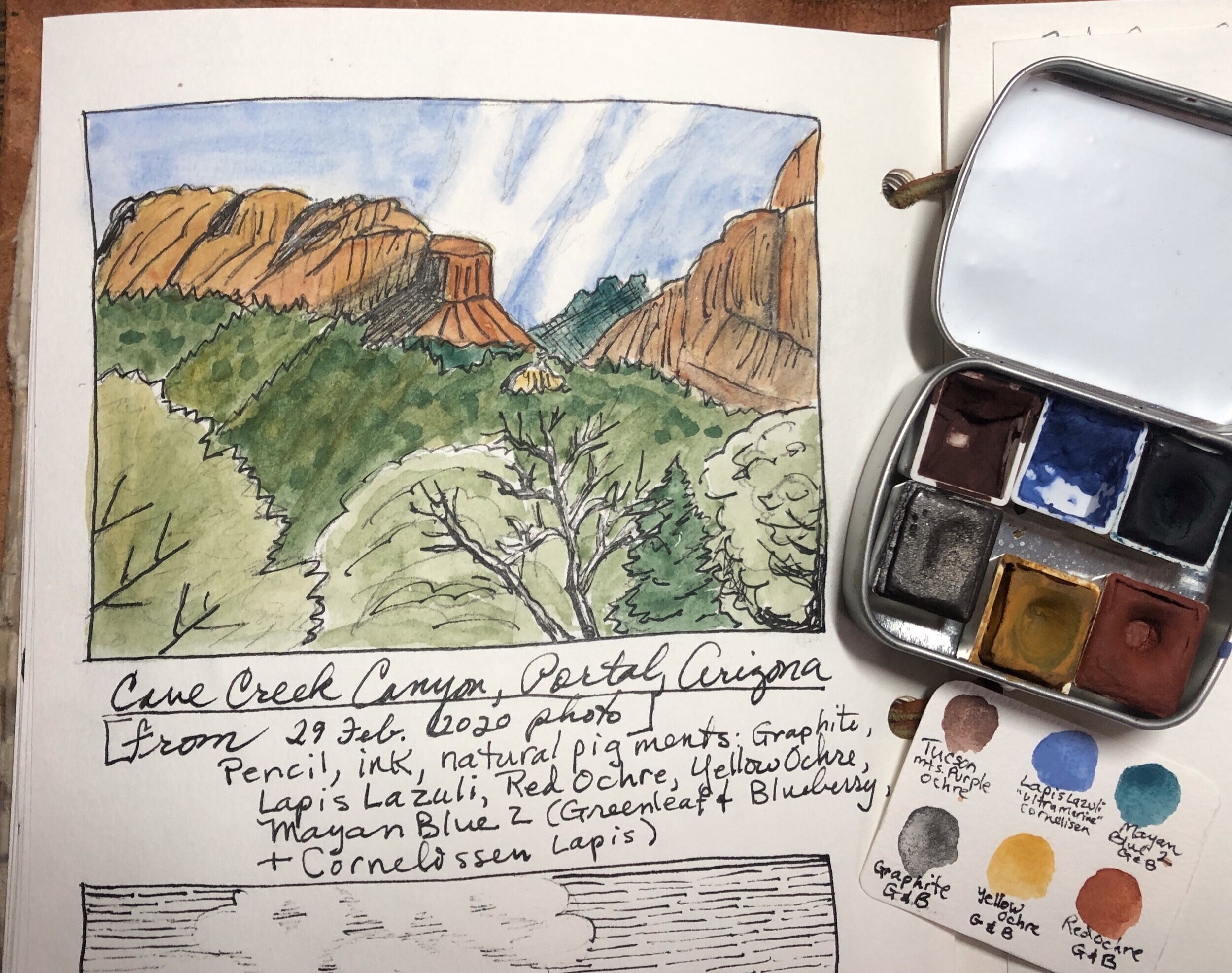
Elegant ink and natural tints
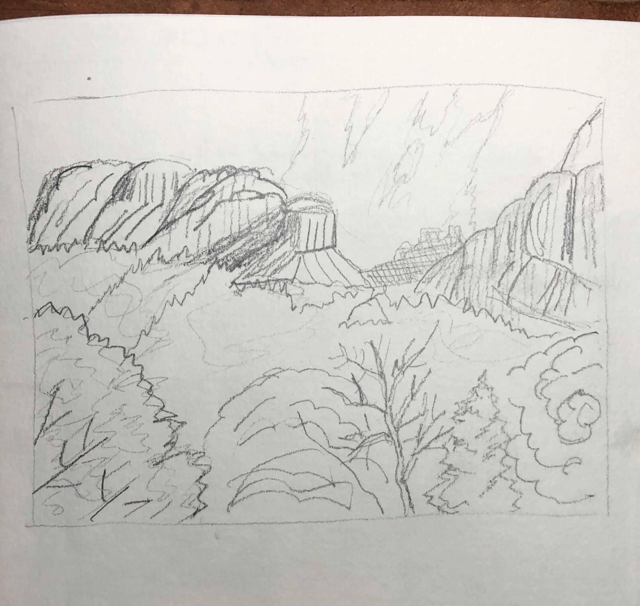
I’ve developed a new obsession of late, with capturing landscapes in just ink—with either a vintage style or a very stylized “poster” effect, such as the scene below, using very spare lines and representations of subjects such as clouds and rocks, rather than faithful reproduction.

But color always seems to sneak its way into my pages . . . and here I’m experimenting with an all-natural-pigment mini palette of just yellow ochre, red ochre, ultramarine (made from real lapis lazuli pigment) and Mayan blue. Interestingly, the lapis, which is the original pigment from which ultramarine was made, does not combine with yellows (even synthetic yellow, such as aereolin) to create green. The Mayan blue, thankfully, does. Mayan blue is a New World pigment developed by the Mayans from indigo plants and a type of clay common in central and southern Mexico. To the Mayans, blue was a sacred color and they painted the bodies of people before they sacrificed them to their gods by throwing them into the cenotes, deep freshwater caves. Some of these cave-sinks have Mayan blue pigment layers several meters thick . . .
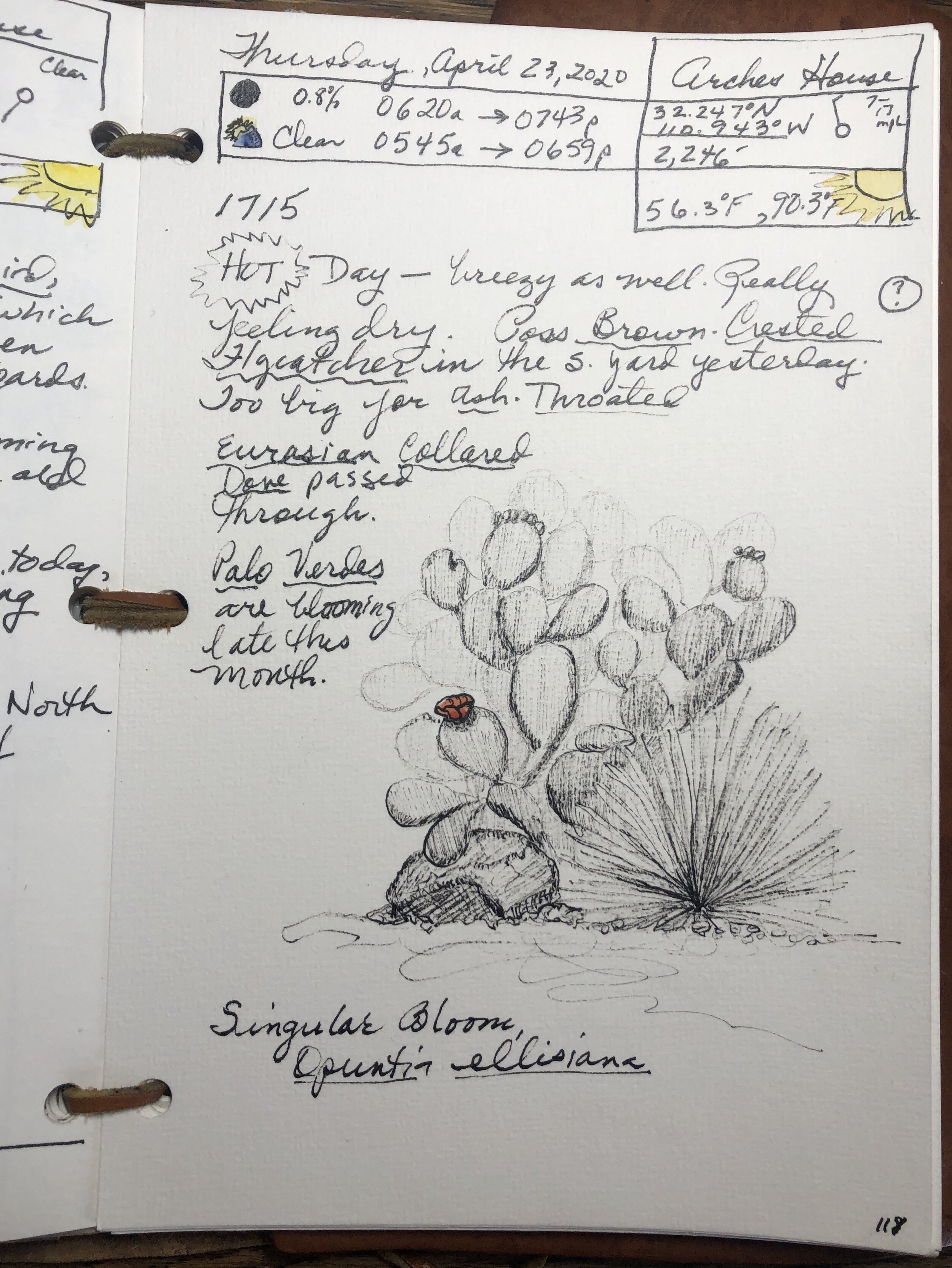
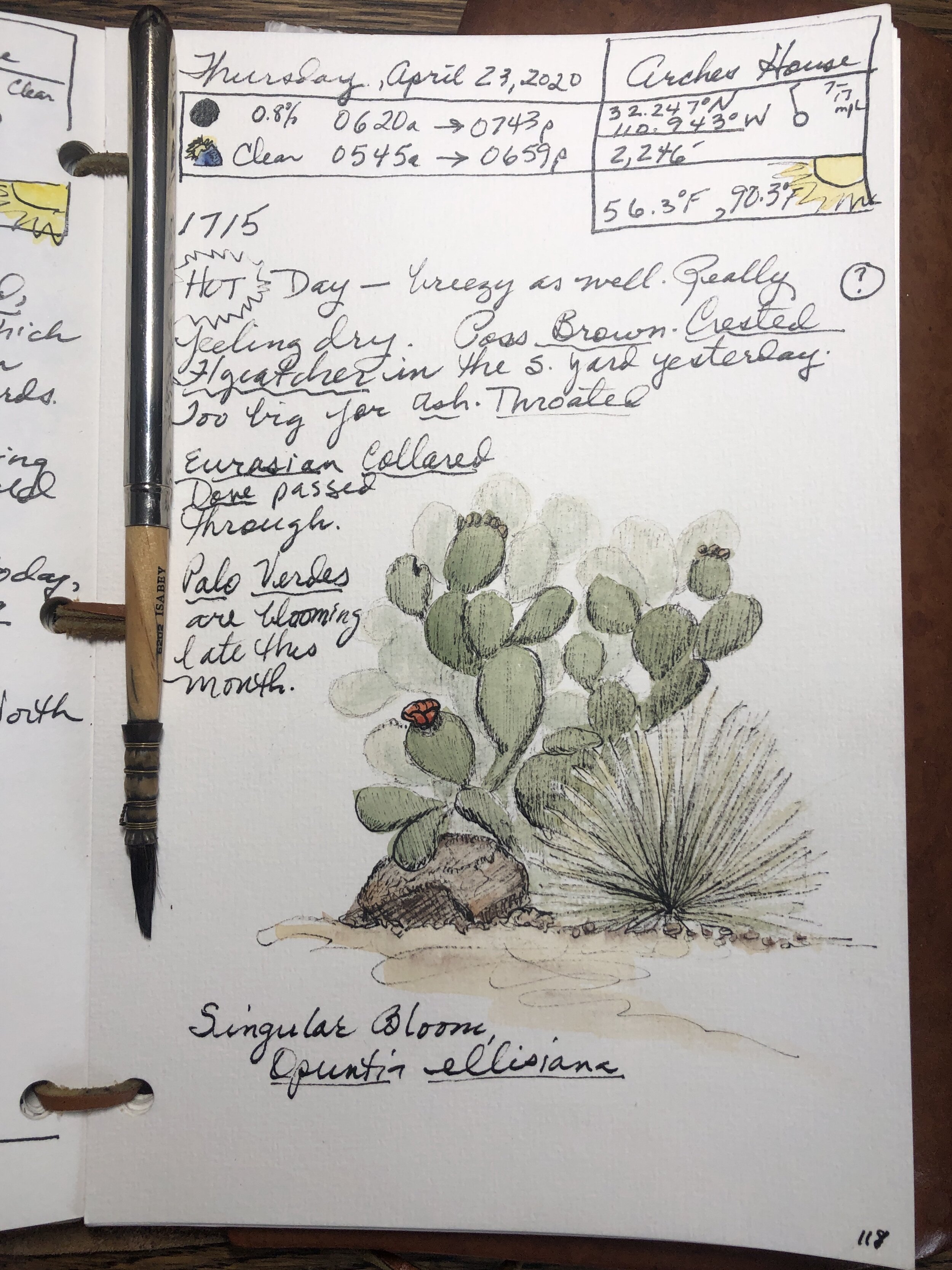
I like the vintage effect of the pale green and yellow ochre for this prickly pear study. The line work was created using a light hand with my fountain pen on the slightly textured paper, barely scritching at times to create the soft, broken-line rendering.

My natural pigment mini palette comprises Tucson Mountains Purple Ochre (handmade by me, from locally collected rock); Ultramarine (from lapis lazuli pigment purchased in London from Cornelissen & Son); and four pigments from Greenleaf & Blueberry, who make the best natural paints anywhere—red and yellow ochre, graphite (which is very sparkly, full of mica), and Mayan Blue 2 (a slightly greener shade).